
- XRP daily chart shows massive liquidity both above and below
- Price might respect supply above or dip first to take lower liquidity
- The liquidity under current price looks suspicious — expect volatility
- No certainty here — just probability and good preparation
Let me be honest with you — XRP on the daily looks like a bit of a mess right now. And I don’t say that lightly.
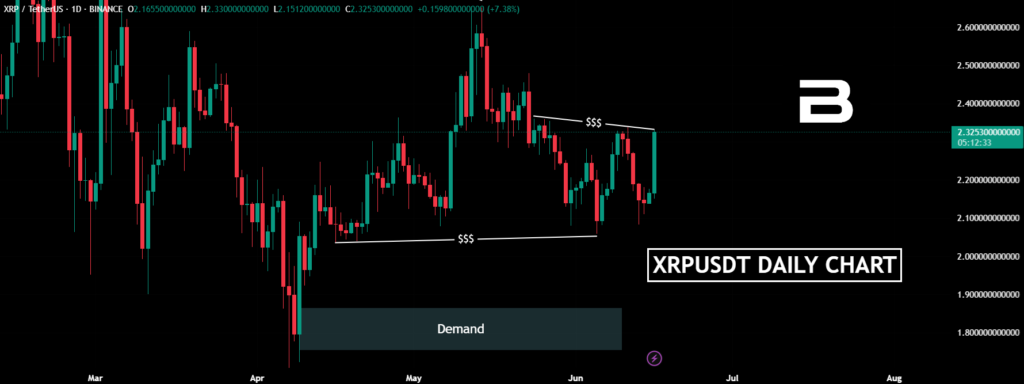
There’s just so much liquidity, both above and below. It’s like a battlefield where you don’t really know who’s going to fire the next shot.
If you zoom out a bit, you’ll spot a nice daily supply zone up top.
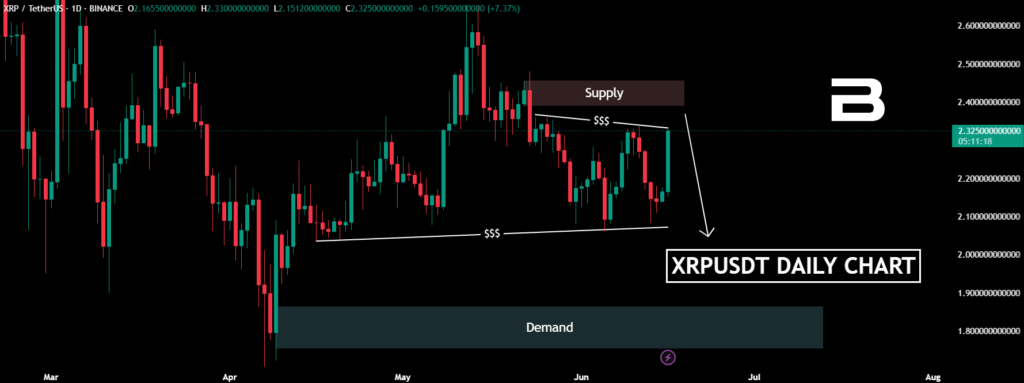
The kind of level that makes you go, “Hmm, price might want to react from here.” But then again… that liquidity sitting below? It’s loud. It’s almost annoying. And honestly, it kind of smells like a trap waiting to be sprung.
Supply Above Vs. Liquidity Below
I’ve seen this kind of setup before. It reminds me of the time I was sure price would respect a supply… only for it to fake out, sweep the lows, and then fly. You think you’re being patient, and boom — the market humbles you.
Could XRP go up from here and respect that daily supply? Totally possible. But could it also dip down first, clear that messy liquidity under our feet, and only then push higher? Absolutely.
Let Go Of Needing To Be Right
As always — we’re not in the business of certainties. I’m not here to promise anything. Price will do what it wants, when it wants.
All I’m doing is outlining the map. Which direction the car drives? That’s up to the driver — and the driver definitely isn’t us.
Scenarios help us stay alert, not arrogant. The XRP chart is loud, but we’re listening carefully. It’s not about predicting the future. It’s about recognizing the possibilities and being ready either way.